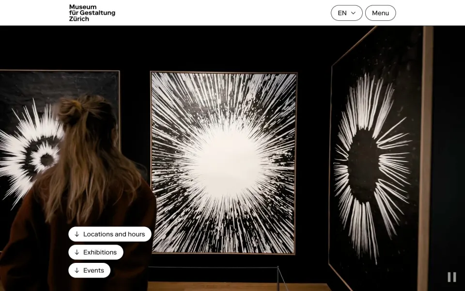
#0010
Swiss web design
What makes a website feel Swiss? A short guide to the grid, the grotesk, white space and restraint, with real examples from the index.
01 From the poster to the browser
In the 1950s, designers in Zurich and Basel built what the world now calls the Swiss Style, or International Typographic Style: strict grids, sans-serif type, flush-left text, objective photography and a lot of white space. Josef Müller-Brockmann, Armin Hofmann and Emil Ruder taught it, and Helvetica and Univers came out of the same years.
Seventy years later, the same ideas are everywhere on the web. A website is a grid of boxes, made of text, read on a screen of any size. The principles of Swiss design fit it almost too well. Today’s Swiss studios use them with more freedom: they keep the order and break it on purpose.
02 The grid
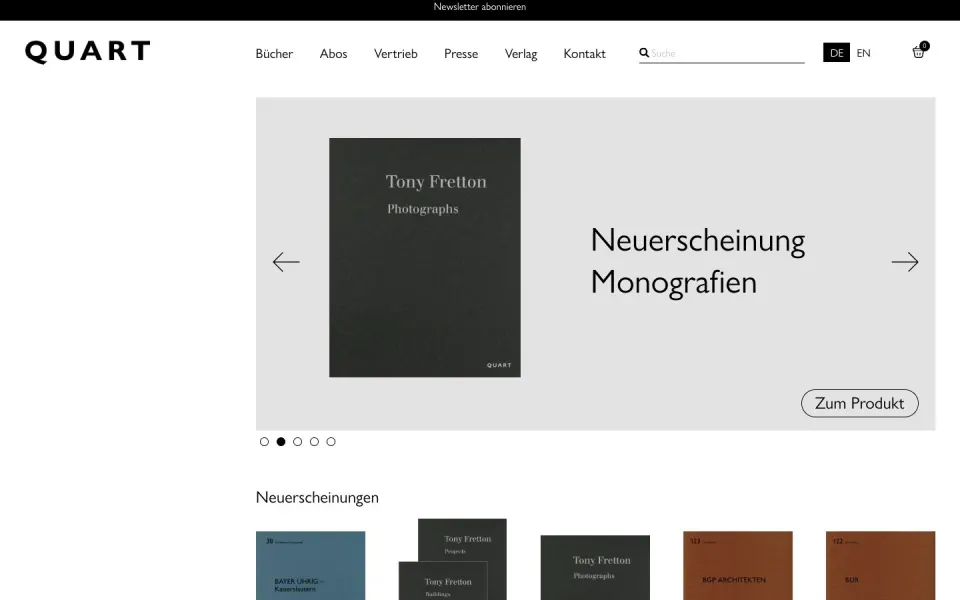
The grid is the backbone. Columns decide where everything goes, and the same columns repeat on every page, so the site feels like one thing. On the web, a good grid also decides how the layout changes from desktop to phone.
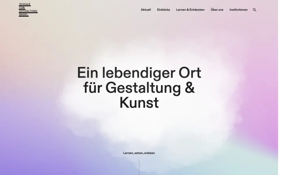
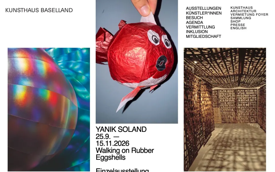
The Swiss approach is to make the grid visible: text and images align to the same lines, and empty columns are kept empty. See all Swiss grid websites.
03 Grotesk type
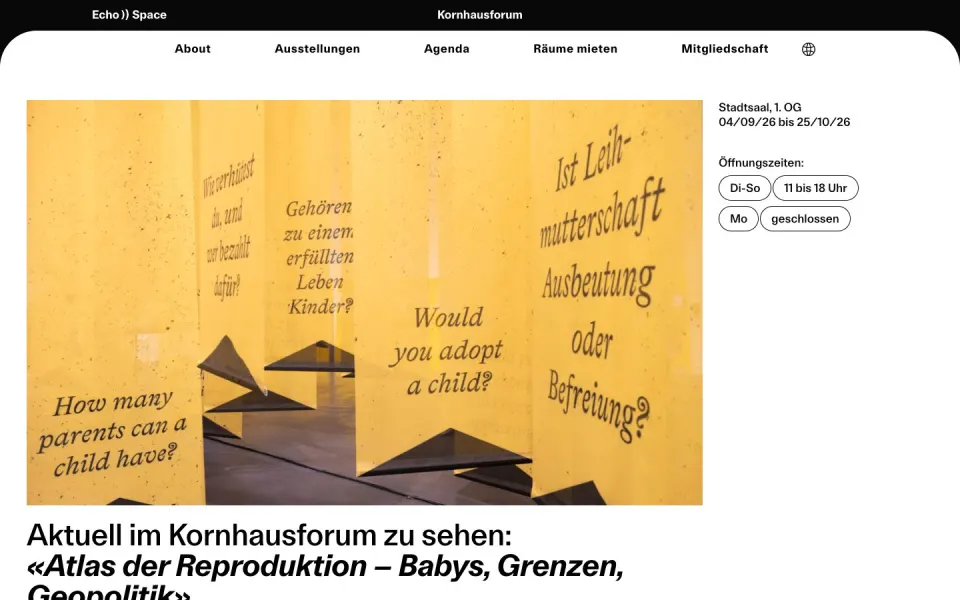
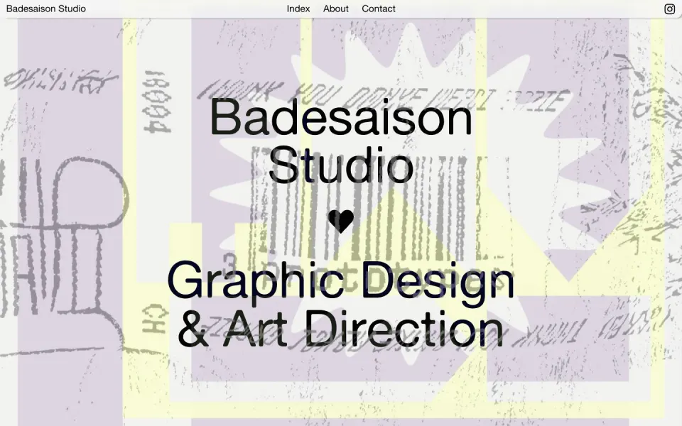
Most Swiss sites use a grotesk: a sans-serif with roots in the 19th century, like Helvetica, Akzidenz-Grotesk or their many new relatives. It is neutral enough to let the content speak and strong enough to carry a whole identity. More than half of the sites on SITED use one. See all grotesk websites.
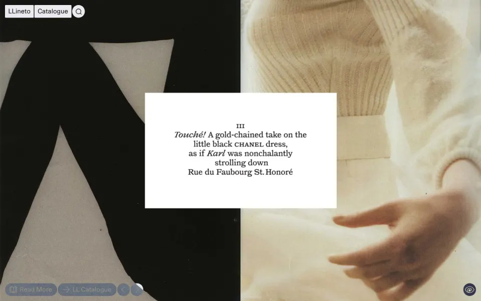
Switzerland also has an unusual number of type foundries, such as Lineto, Swiss Typefaces, Dinamo and Optimo. Many studios commission a custom typeface for the client, which is why so many Swiss websites feel unlike anything else. See websites with a custom typeface or browse all fonts in use.
04 Big type, few words
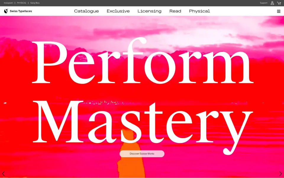
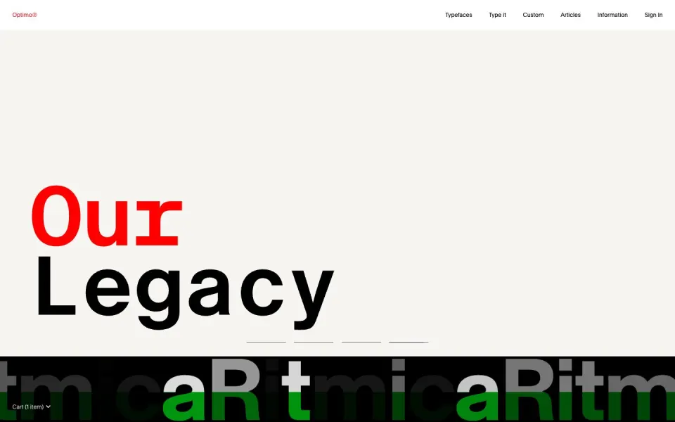
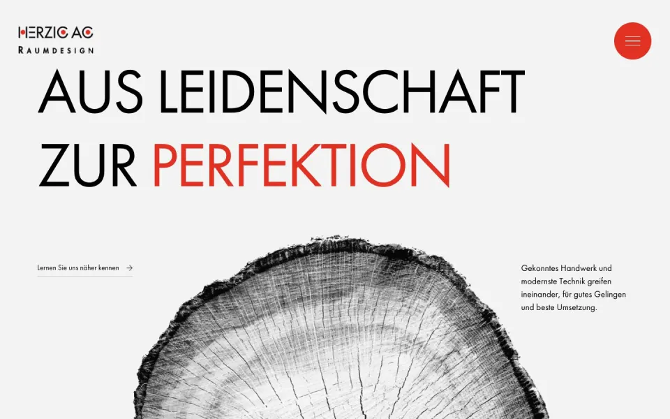
A Swiss website often opens with one sentence set very large, and nothing else. Oversized type replaces the hero image: the words are the picture. It works because the rest of the site is quiet. See all websites with oversized type.
05 White space and restraint
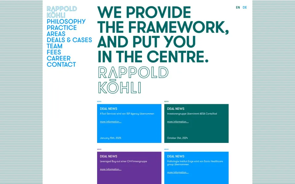
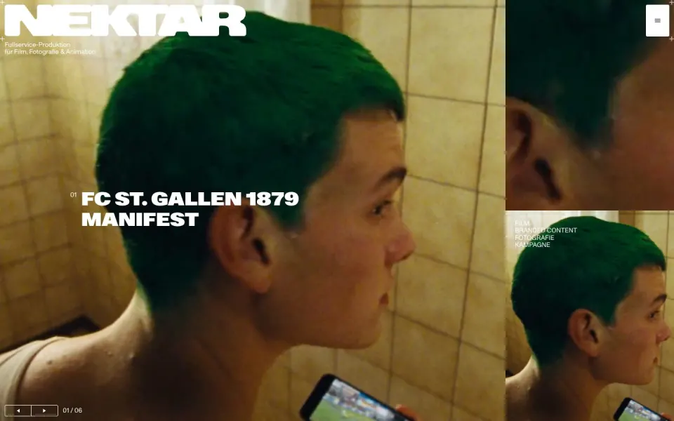
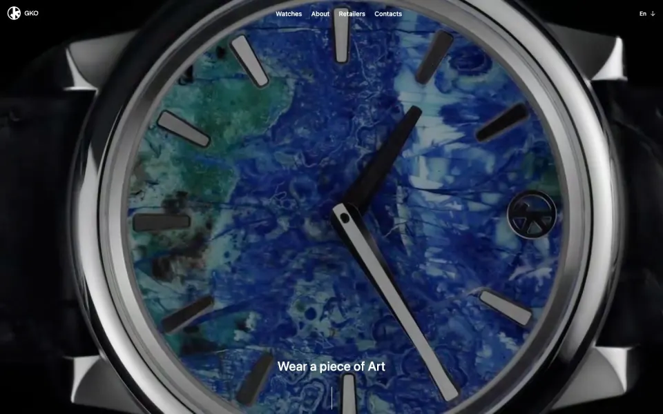
Restraint is the most Swiss thing of all. Two colours, one typeface, a lot of empty space, and no decoration that does not do a job. It is harder than it looks, because every remaining detail has to be right. See all minimal websites.
06 Breaking the rules
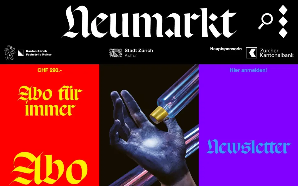
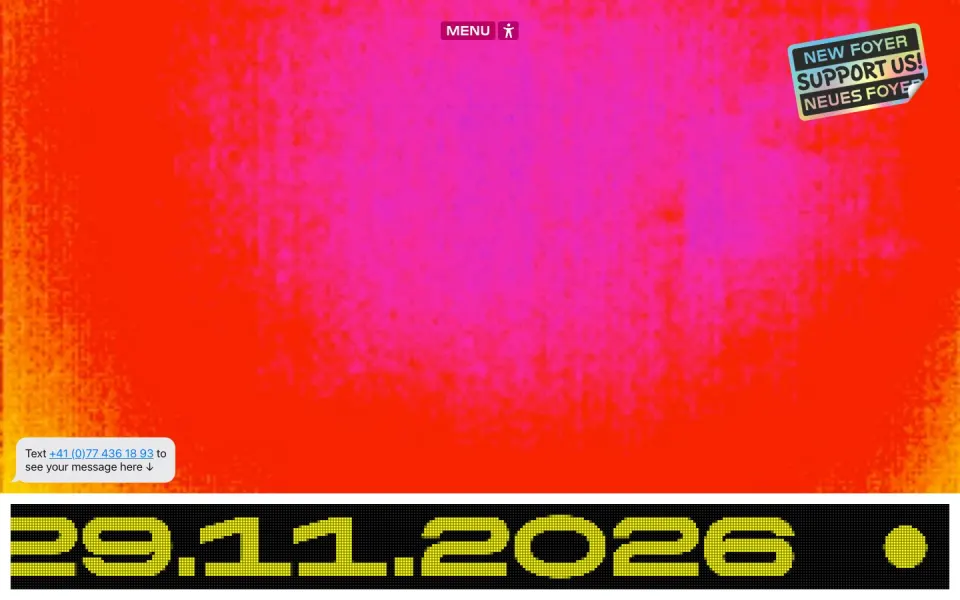
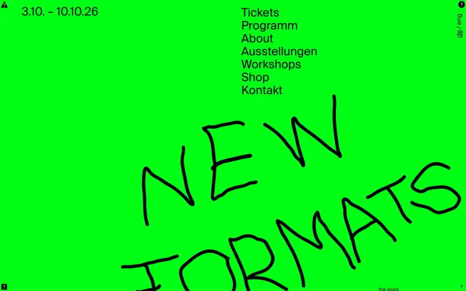
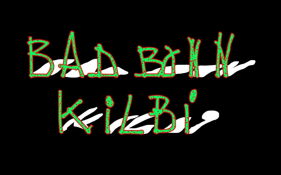
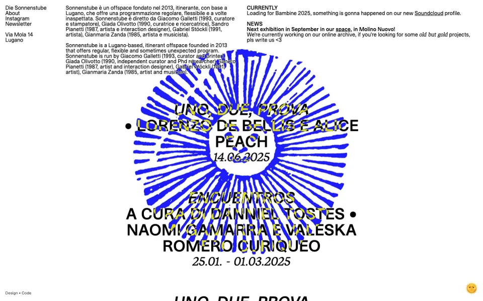
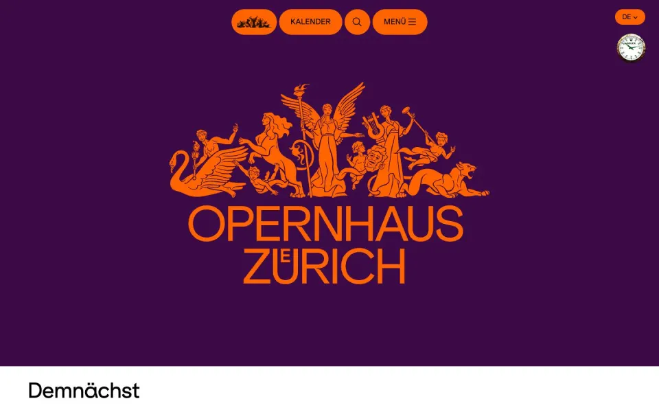
The other side of Swiss design is just as strong. Basel and Zurich have a tradition of experimental and brutalist work, especially for culture: festivals, art spaces, theatres and clubs. Raw HTML, system fonts, clashing colours and type that moves. The rules are still there, they are just being pushed. See brutalist websites and experimental websites.
07 Four languages, one layout
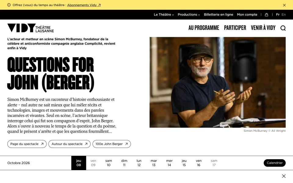
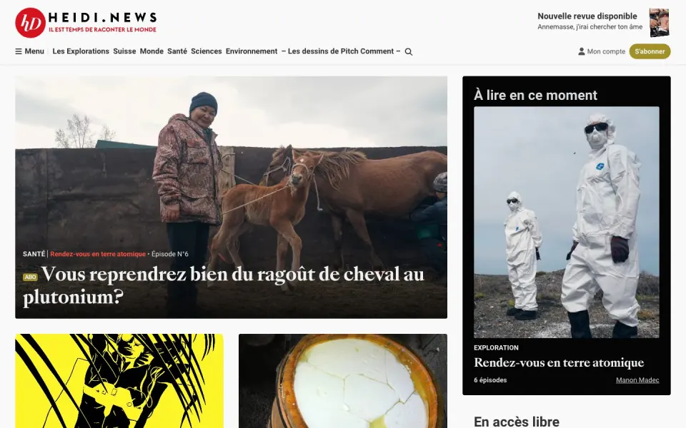
Switzerland has four national languages, and many sites need at least two or three. German words are long, French sentences are longer, and the same layout has to hold all of them. Swiss designers learn early to design with real text and to leave room for it.
08 Where it is made
Most of the studios are in Zurich, Geneva, Basel, Bern and Lausanne, with a strong scene in St. Gallen, Lucerne and Ticino. Zurich, Geneva, Basel, Bern, Lausanne and Lugano each have their own page, and every studio has one too: see all agencies.
Want to keep going? Browse the full index, read the glossary or see how we choose.